Registration UX

Account Setup Process

To enhance the New User Retention Rate for Smeet, the whole Registration Process was reassessed.

Overview

Role
UI/UX Design

Genre
Social Game

Engine
In-House Engine

Tools
Photoshop, Illustrator

Team Size: 1

Duration
2021 – 2023

Platform
PC, Web Browser, Android,
macOS, iOS

Background

Smeet is a social game where players connect through customizable avatars, creative spaces like individual rooms, and challenges.

The current registration process already offers players their first chance to express individuality by choosing names and avatars.
A strong first impression after downloading the game is vital, but up to this point, the First-Time User Experience was partly suboptimal and outdated. The unclear navigation and visually unengaging screens might be hindering a smooth onboarding process.

Goals

I aimed to keep new players engaged beyond their first session by designing an onboarding process that feels both seamless and enjoyable. My focus was on creating a smooth introduction to the game that captures users’ attention immediately and ensures they feel comfortable and motivated to continue playing.

Challenges

The revamped registration interface is designed with a mobile-first approach for its initial iteration. The limited screen space and strict requirements can amplify this frustration, while too many fields at once overwhelm first-time players.

Identifying drop-off points and understanding the reasons behind user abandonment is a complex challenge, largely due to the limited data and the lack of detailed insights that could not be tracked during the process.

Roles and Responsibilities

Research and Data Analysis

To uncover key insights about the current registration process, I conducted usability tests to pinpoint pain points and areas for improvement. Even with our extremely limited data, I gained an understanding of where users were encountering difficulties.

Additionally, I worked to identify the target audience’s preferences, challenges, and motivations, ensuring that the redesigned process would align with their needs and expectations.

Original

Final Result

UX Design

I began by mapping out the entire user journey—from the moment a user downloads the app to the completion of their registration.  I also focused on designing for edge cases, such as error handling and recovery, to make sure users could easily correct mistakes without feeling frustrated or stuck. To evaluate the effectiveness of the redesign, I conducted A/B tests, comparing the new registration flow with the original, to measure improvements in user engagement and completion rates.

UI Design

I started by creating wireframes  to rough-test and refine ideas for the new registration flow, ensuring that every iteration brought us closer to an intuitive user experience. My design focused on crafting a user-friendly interface optimized for mobile, with clear input fields, accessible buttons, and progress indicators to guide users seamlessly through the process. Throughout, I ensured that the design adhered to the brand’s guidelines, balancing visual consistency with a focus on clarity and simplicity.

Room Design

The registration process was enhanced with a new feature allowing users to select their starting room. This provided an opportunity to introduce a fresh addition to the starting room lineup, focusing on a theme not previously represented.

Prototypes

Final Result

The new theme emphasizes coziness, aimed at appealing to a specific player segment identified as underrepresented in our offerings. The room is designed with abundant plants, natural light, a serene garden, and a warm, inviting atmosphere. To expedite the conceptualization process, AI tools proved invaluable for generating quick mockups that effectively conveyed the initial vision.

Key Takeaways

Error Handling

Real-time validation and visible error prompts near fields make the process smoother and more user-friendly. This turned out to be the point of most confusion for users. Addressing errors effectively prevents drop-offs and keeps users engaged.

Importance of Metrics

Lacking key data throughout the project hindered insight into user issues, forcing reliance on assumptions and slowing optimization.

Early metric implementation would have improved guidance and measured success more effectively.

Achievements

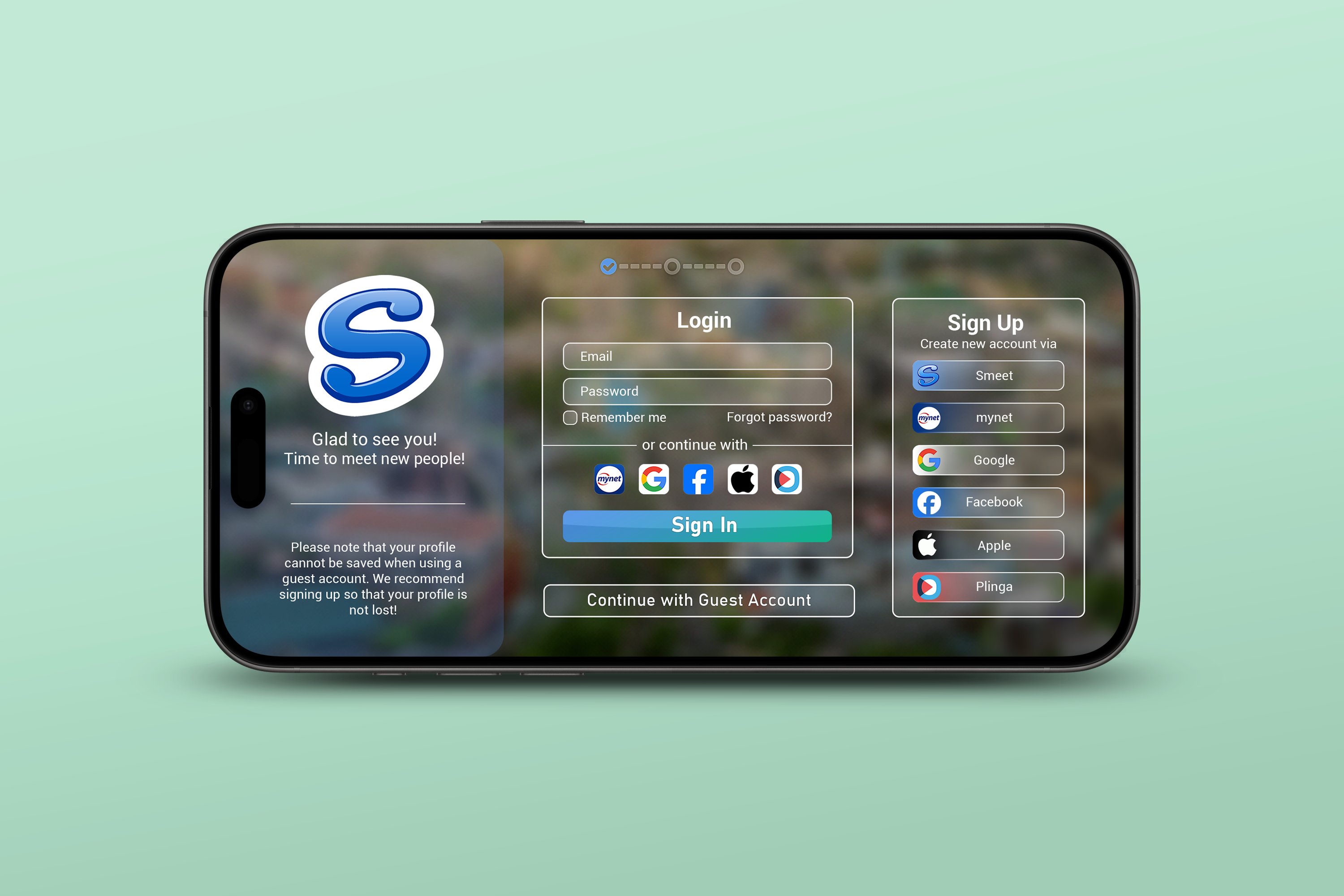
Minimized Pain Points

By improving error handling and providing clearer instructions, I was able to reduce the number of user mistakes during the registration process. This helped to minimize frustration, making the experience smoother and more intuitive for them. As a result, they were less likely to abandon the process due to confusion or errors, contributing to a higher completion rate.
© Copyright 2025ImpressumDatenschutz