


The Personalization
A one-size-fits-all bundle structure with generic offers failed to address individual player needs.

Outdated Design
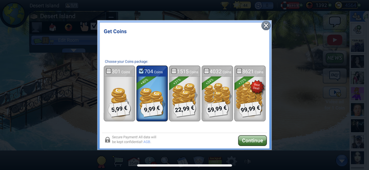
The shop’s outdated visuals, poor mobile optimization, and small, inconsistent UI elements created an unengaging experience.

Interrupted Flow
The purchasing experience felt inconsistent due to lots of payment providers and payment methods. Too little system feedback interrupted the user flow.

Low Value Perception
Due to unclear communication of value, players lost trust and motivation at the point of purchase, resulting in a confusing and disengaging experience.

Information Clarity
Unclear pricing, multiple payment providers, and non-transparent discounts made it difficult to understand costs and value, while limited and inconsistent information made offers harder to evaluate.

The Personalization
A one-size-fits-all bundle structure with generic offers failed to address individual player needs.
Outdated Design
The shop’s outdated visuals, poor mobile optimization, and small, inconsistent UI elements created an unengaging experience.
Interrupted Flow
The purchasing experience felt inconsistent due to lots of payment providers and payment methods. Too little system feedback interrupted the user flow.
Low Value Perception
Due to unclear communication of value, players lost trust and motivation at the point of purchase, resulting in a confusing and disengaging experience.
Information Clarity
Unclear pricing, limited feedback, and an outdated design make it hard to evaluate offers and understand value.
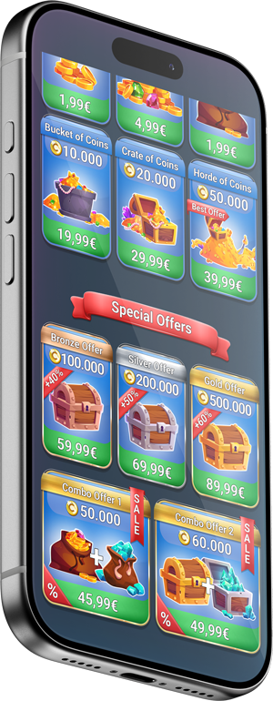
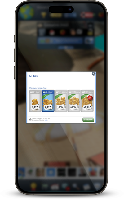
The existing shop went beyond a visual issue. Inconsistent, tiny visuals, unclear information and a one-size-fits-all layout already left players confused.
01 Deeper Than Visuals
The existing shop went beyond a visual issue. Inconsistent, tiny visuals, unclear information and a one-size-fits-all layout already left players confused. But on top of that, technical constraints imposed by the game engine and payment providers disrupted the flow added an extra layer of complexity.

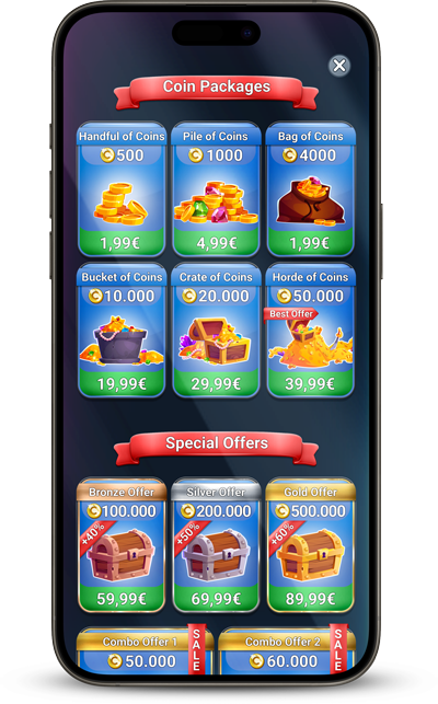
Visual Freshness
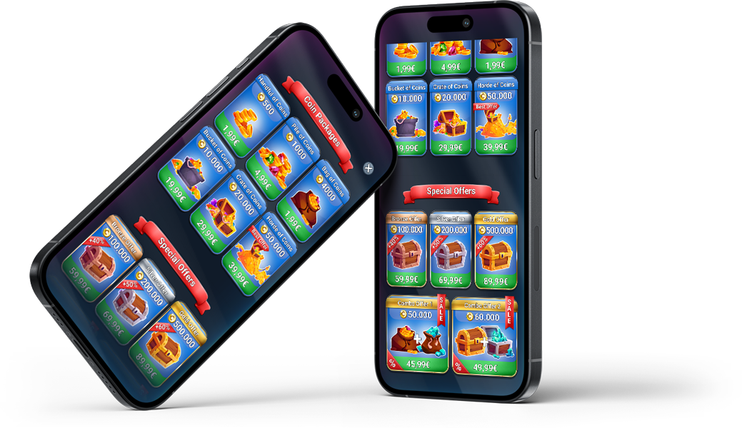
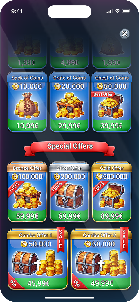
A modern visual identity transforms the entire feel of the shop. Finally, the style will convey a sense of a professional product.
Personalized Bundles
New bundle concepts were developed with pricing strategies informed by earlier research, aiming to deliver clear value while supporting monetization goals.
Reworked Flow
With the problem framed, I explored different approaches to restructuring the purchase flow and bundle architecture — rethinking how offers are presented across different player segments.
01 Journey Mapping
02 Killing Darlings
01 Baby Steps
01 Baby Steps


Monetization Balance
Ensuring a balance between monetization goals and the user experience can be tricky. In-game purchases are supposed to be enticing, but not coercive. The project started out as a UI adjustment, but soon raised questions about the current flow/user journey concerning acquiring coins. We needed to provide players with more direct non-monetary ways to earn rewards, making the shop feel optional but rewarding.