


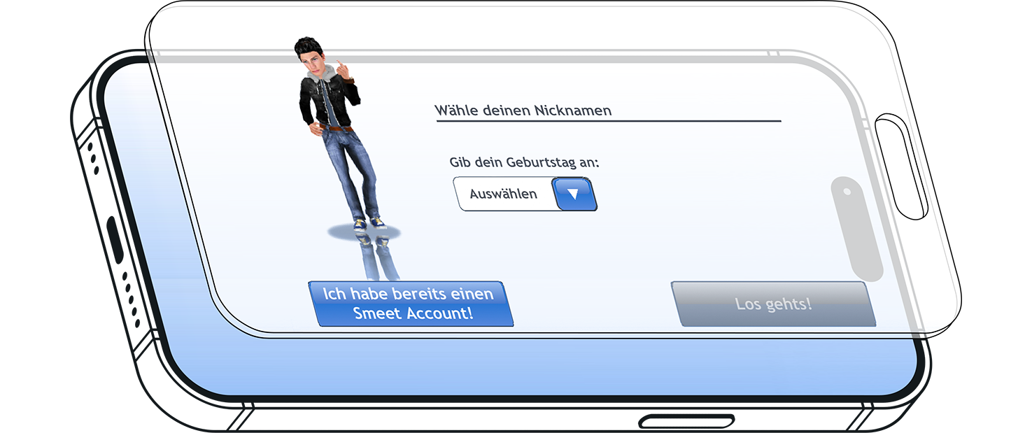
"I had no idea how long it took me just to reach the sign-up page. There's no way I knew whether or not I was signing up correctly."
- First Time User
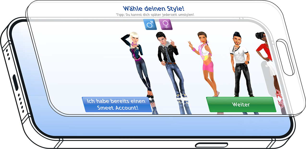
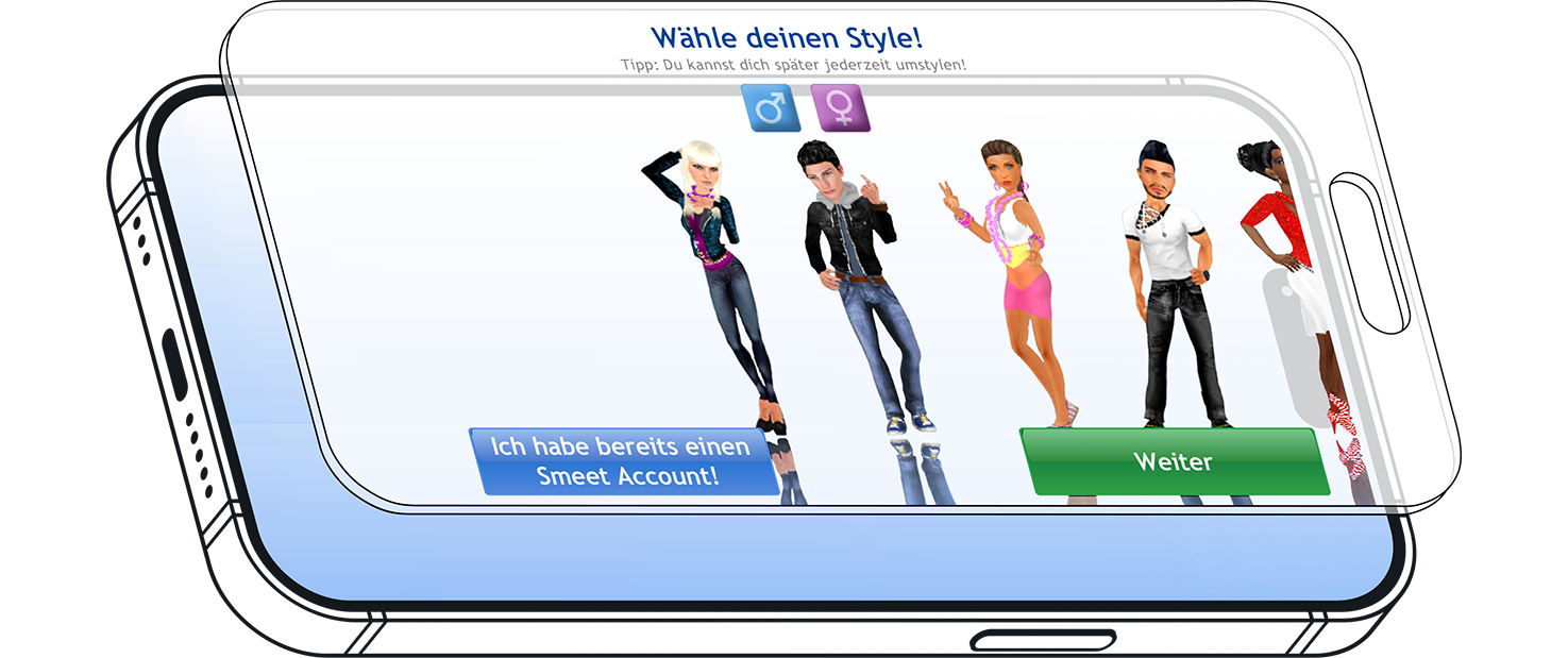
"Why does there have to be a gender field just for selecting an avatar? They all seemed completely unappealing to me."
- First Time User
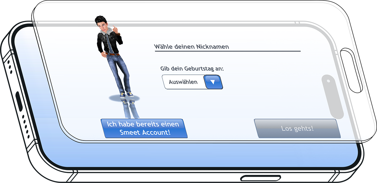
"I feel silly for putting in my complete birthday. This is a game; it's supposed to be fun, not fill out a form. It seemed very dated in comparison with the others I've tried."
- Long Time User
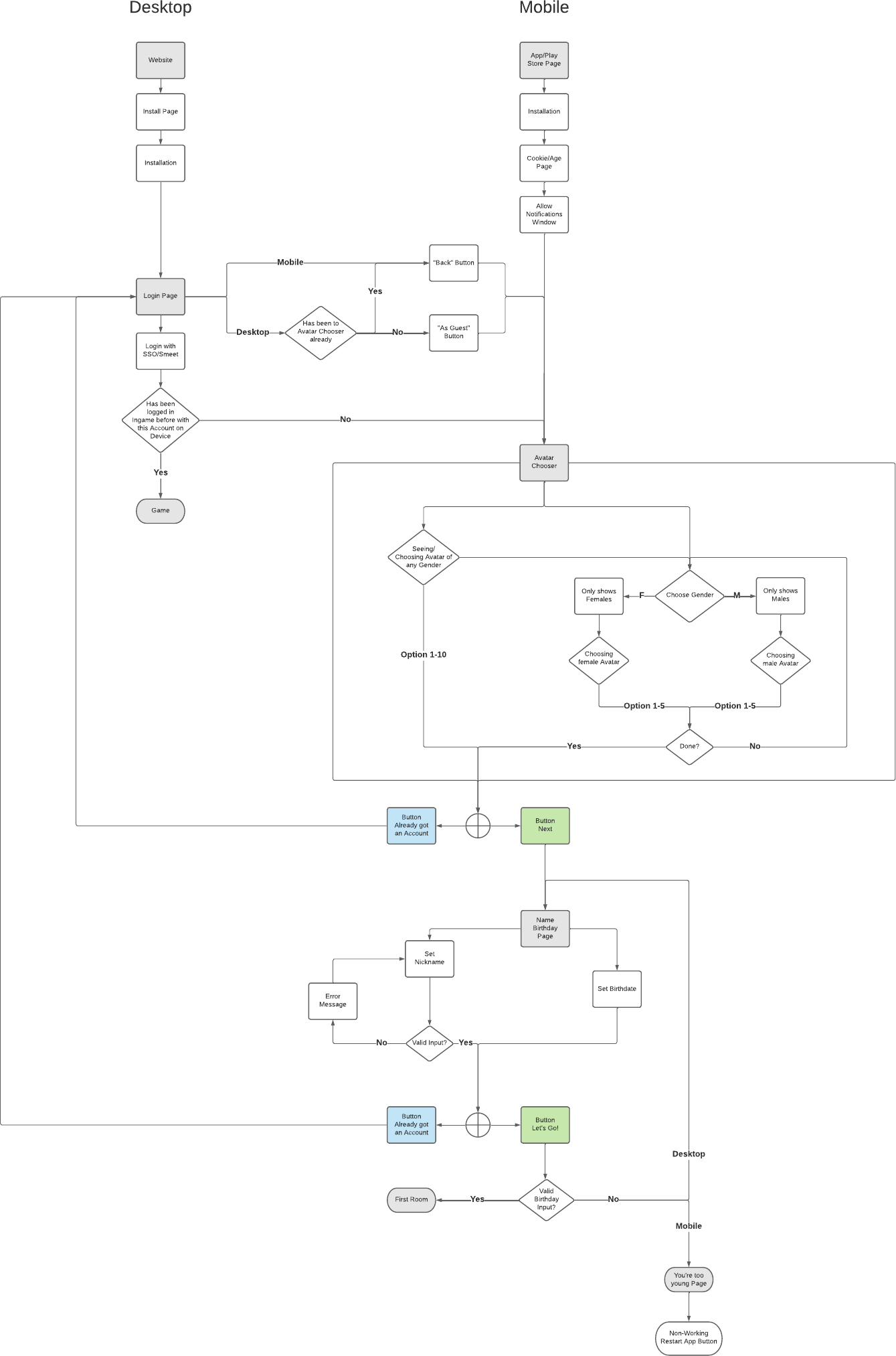
The biggest constraint during the empathize phase was the near-absence of quantitative data. Without reliable drop-off tracking baked into the funnel, I couldn't simply read a dashboard to find where users were leaving.
Beyond diagnosing pain points, I worked to understand who Smeet's new users actually were: their motivations for joining a social game, their tolerance for friction during sign-up, and what kind of first impression would make them want to stay.
Visually Unengaging Screens
The outdated visual design failed to create a strong first impression, making it harder to keep new users motivated to complete sign-up.
Unclear Navigation
The flow lacked clear guidance, leaving users unsure where they were in the process or what came next.
Registration Felt Disconnected From the Game
The flow lacked clear guidance, leaving users unsure where they were in the process or what came next.
Clunky on Mobile
The flow was built with desktop assumptions, making it frustrating on phones — small tap targets and a layout not designed for touchscreens.
Without hard funnel data, defining the problem required committing to an educated hypothesis: users weren't abandoning because the game was unappealing, but because the registration interface was creating unnecessary cognitive load at exactly the wrong moment.
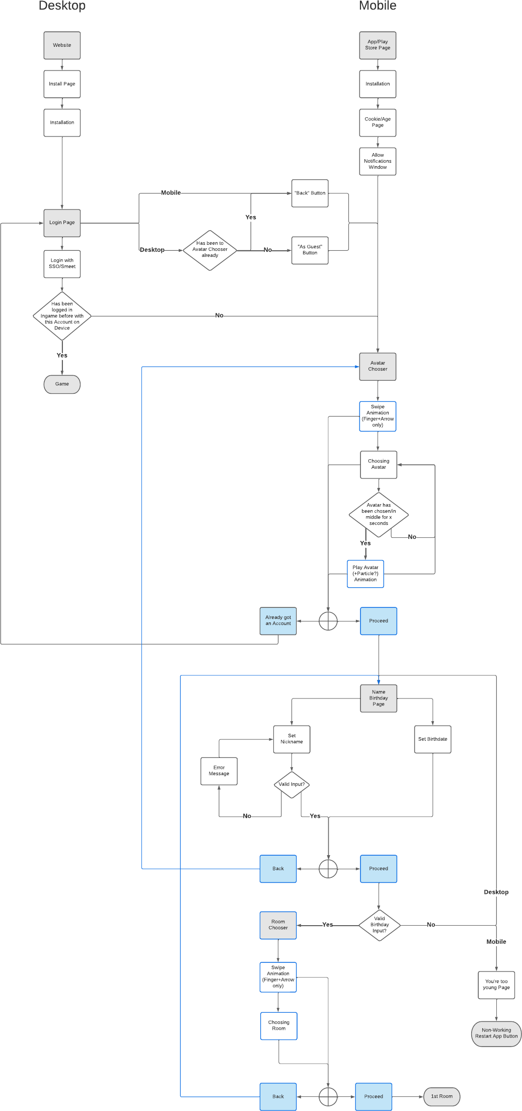
The define phase made it clear that the existing flow had been designed with desktop assumptions baked in. Re-framing the problem statement around a mobile-first context changed what "good" looked like entirely
01 The Drop-Off Hypothesis
Without hard funnel data, defining the problem required committing to an educated hypothesis: users weren't abandoning because the game was unappealing, but because the registration interface was creating unnecessary cognitive load at exactly the wrong moment. A first-time user has zero investment in the product yet — any friction at this stage is disproportionately costly compared to friction encountered later.
02 Mobile as the Constraint
The define phase made it clear that the existing flow had been designed with desktop assumptions baked in. Re-framing the problem statement around a mobile-first context changed what "good" looked like entirely. Fewer fields per screen, larger tap targets, and inline feedback rather than end-of-form error summaries became non-negotiable requirements rather than nice-to-haves.
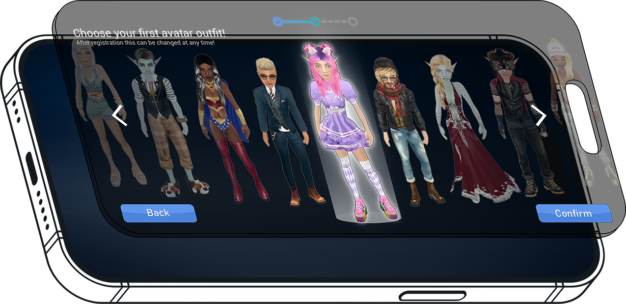
01 Onboarding Gameplay
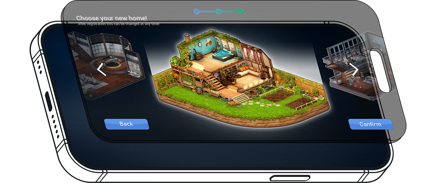
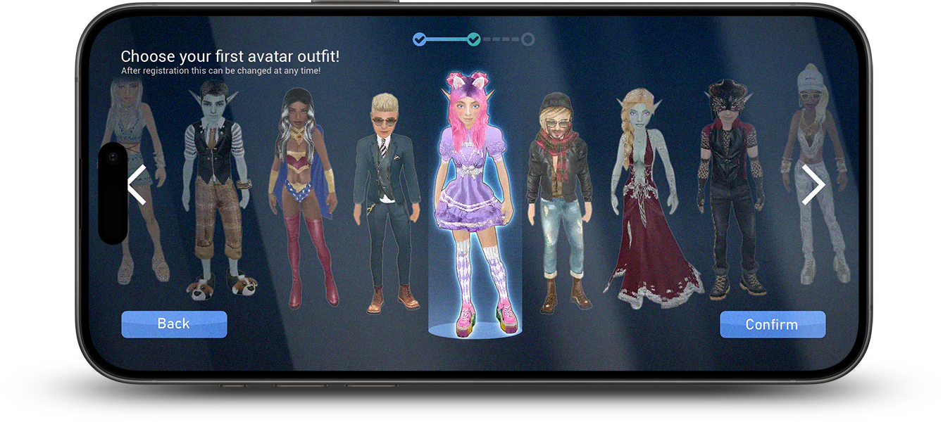
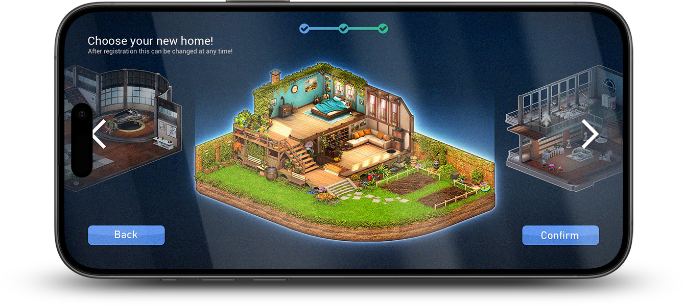
One of the more interesting reframes during ideation was treating registration not as a gate before the game, but as the beginning of it. Smeet's identity is built around self-expression, so introducing a more rounded avatar selection and room choice within the flow might transform a bureaucratic step into something closer to a character creation screen.
02 Filling Gaps
With limited user research to draw from, ideation also had to account for edge cases that data couldn't surface: what happens when a username is taken, how error recovery should feel, where a user who pauses mid-flow should land when they return. Mapping these scenarios explicitly during ideation prevented them from becoming last-minute patches during implementation.
One of the more interesting reframes during ideation was treating registration not as a gate before the game, but as the beginning of it.
With limited user research to draw from, ideation also had to account for edge cases that data couldn't surface: what happens when a username is taken, how error recovery should feel, where a user who pauses mid-flow should land when they return.

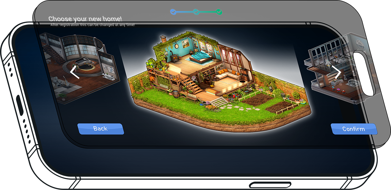
New Cozy Room
Introduce a nature/cozy aesthetic room to appeal to an underserved player segment identified through research.

Step-by-Step Flow
Split registration into distinct screens — one task per view — to prevent overload and guide users naturally.

Progress Indicator
A persistent step-bar shows how far along users are, reducing anxiety about an unknown endpoint.

Room Selection
Add a room-pick step to onboarding — early personalisation that creates emotional buy-in before entering the game.

Inline Error Validation
Real-time field validation with clear, actionable error text directly beneath each input field.

Reduced Field Count
Defer non-essential data collection to post-registration. Only ask for what's strictly needed upfront.

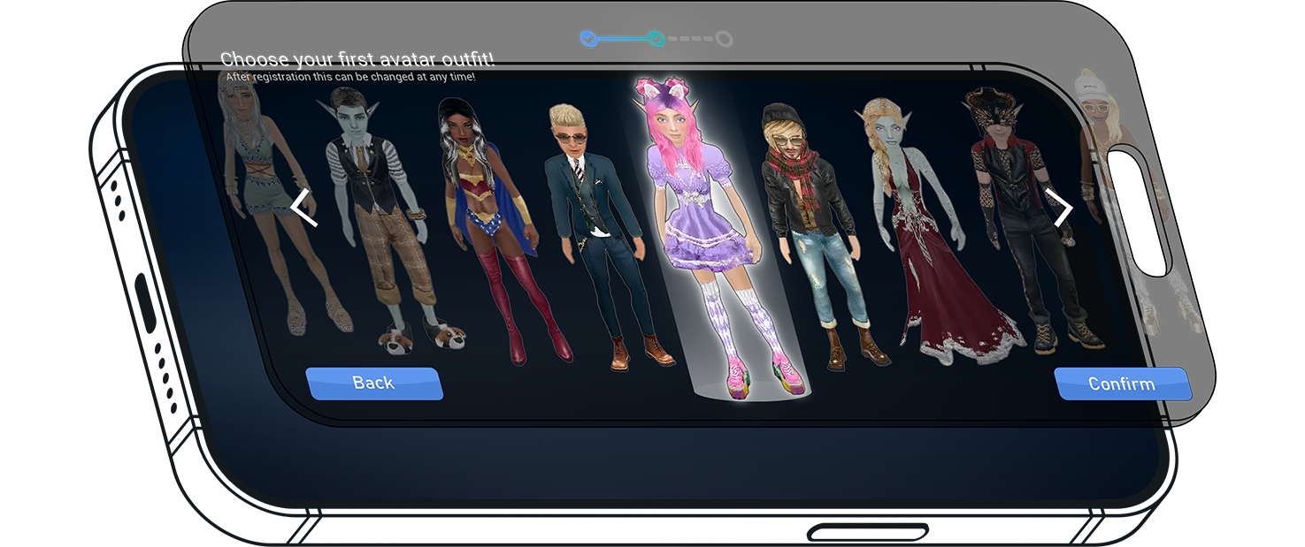
Avatar Customization
Show a live preview of the user's avatar as they customise it, making the experience tactile and rewarding.

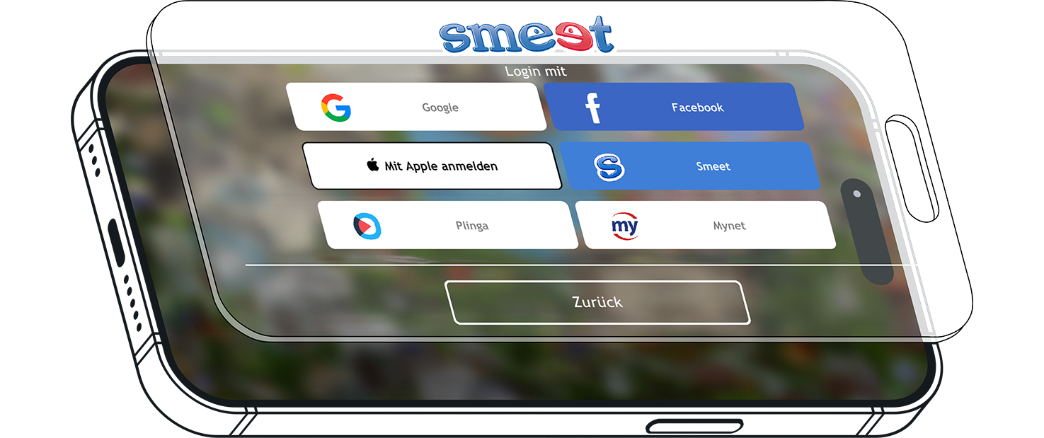
Updated Look
A more modern look will invoke more trust. Especially mobile users will profit from a more accessible layout.


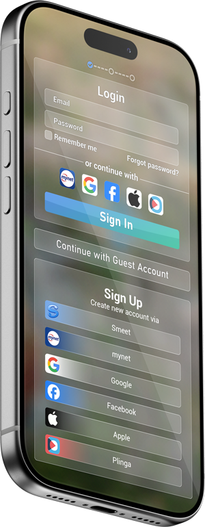
 Before
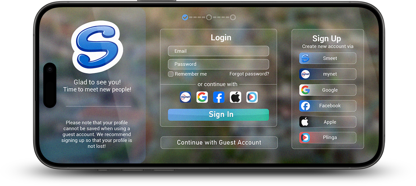
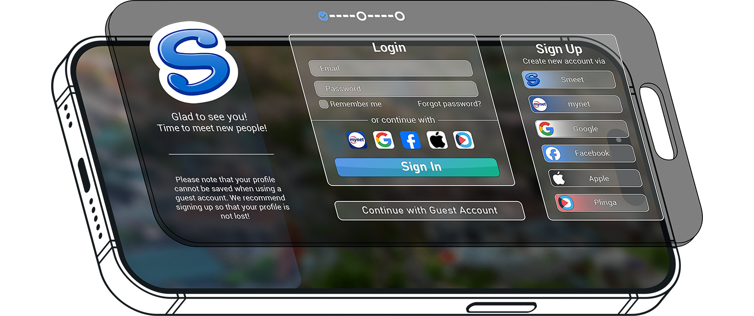
 After
After
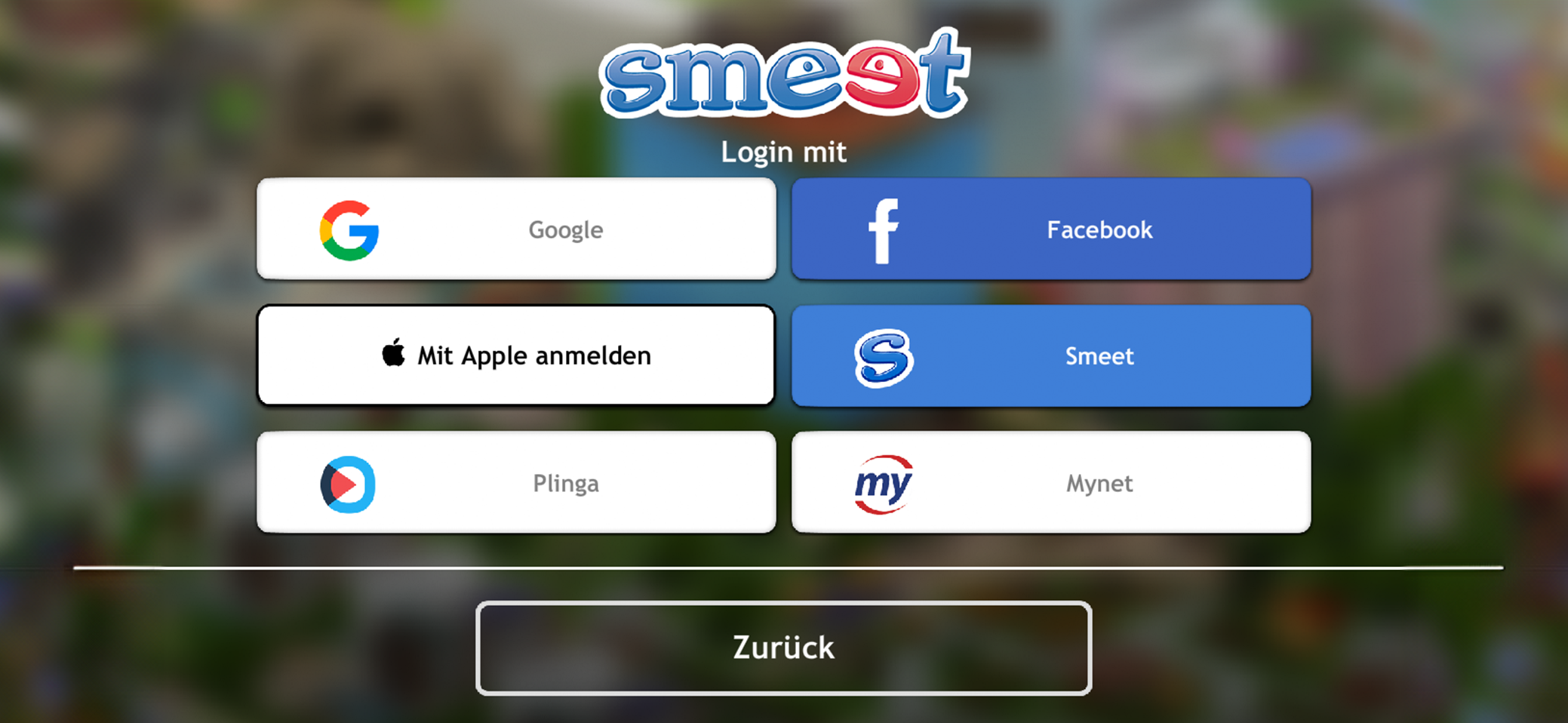
 Before
 After
After
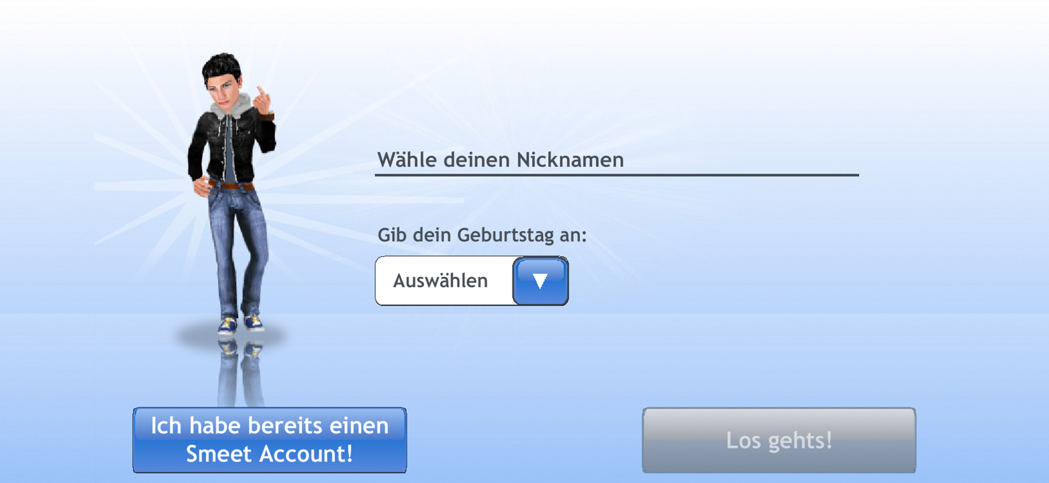
 Before
 After
After
 Before
 After
After
 Before
 After
After
 Before
 After
After

01 Comparisons
02 Error States


Minimize Pain Points
By improving error handling and providing clearer instructions, I was able to reduce the number of user mistakes during the registration process. This helped to minimize frustration, making the experience smoother and more intuitive for them. As a result, they were less likely to abandon the process due to confusion or errors, contributing to a higher completion rate.